Difference between revisions of "Support Overhaul by gerg"
(Created page.) |
Foxfirefey (Talk | contribs) m |
||
| Line 21: | Line 21: | ||
The next set contains the search terms the user used to get to the request form, the known issues files that were presented to them (if any), and the FAQs that were given to them. I envision that FAQs can be much shorter and much more direct answers to questions if this system is implemented. This way, volunteers know what has already been said to the user, so that there aren't "but I already tried that" fests. They also can say "as was shown when you opened this request, the system is down, yo." as appropriate. | The next set contains the search terms the user used to get to the request form, the known issues files that were presented to them (if any), and the FAQs that were given to them. I envision that FAQs can be much shorter and much more direct answers to questions if this system is implemented. This way, volunteers know what has already been said to the user, so that there aren't "but I already tried that" fests. They also can say "as was shown when you opened this request, the system is down, yo." as appropriate. | ||
| + | |||
| + | [[Category: Support]] | ||
Revision as of 19:59, 19 July 2008
The idea I had to overhaul the Support System is documented on this page.
Instead of like on LJ and clone sites, where you can just go to the request page and type, this system attempts to figure out the most useful information that the user needs at the time and shows it to them.
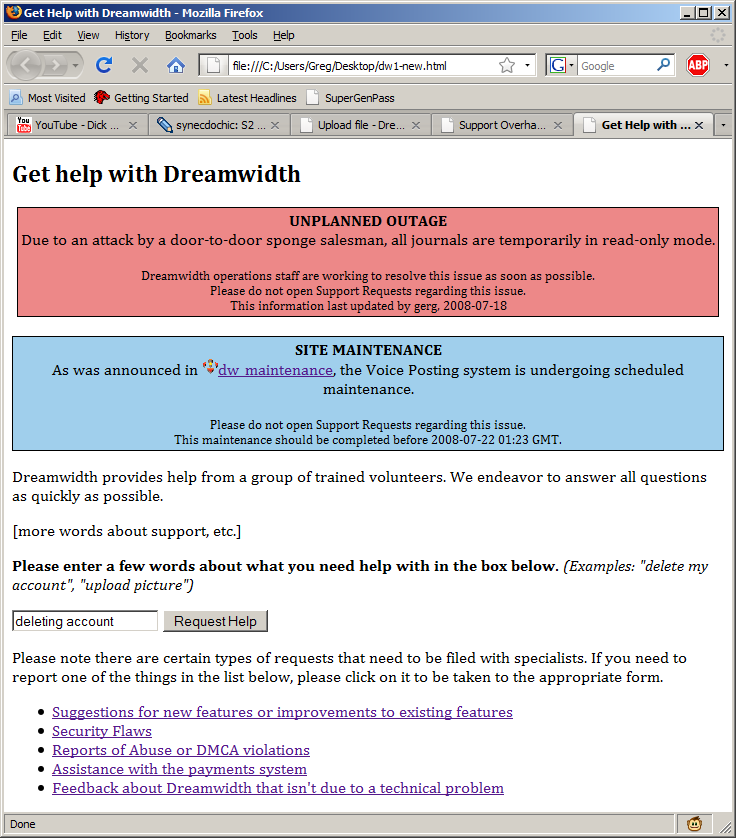
Instead of the current request submittal form, clicking "Help" would take the user to a page like this:

There, we can say text about the support system, estimated wait, etc. but it also gives the user a very clear idea of how to move forward (type a query into the box.) There are also links to the special forms for abuse, feedback, webmaster, payments, and suggestions. We could also put a bright yellow box at the top of this page with anything that is seriously broken and effects DW as a whole.
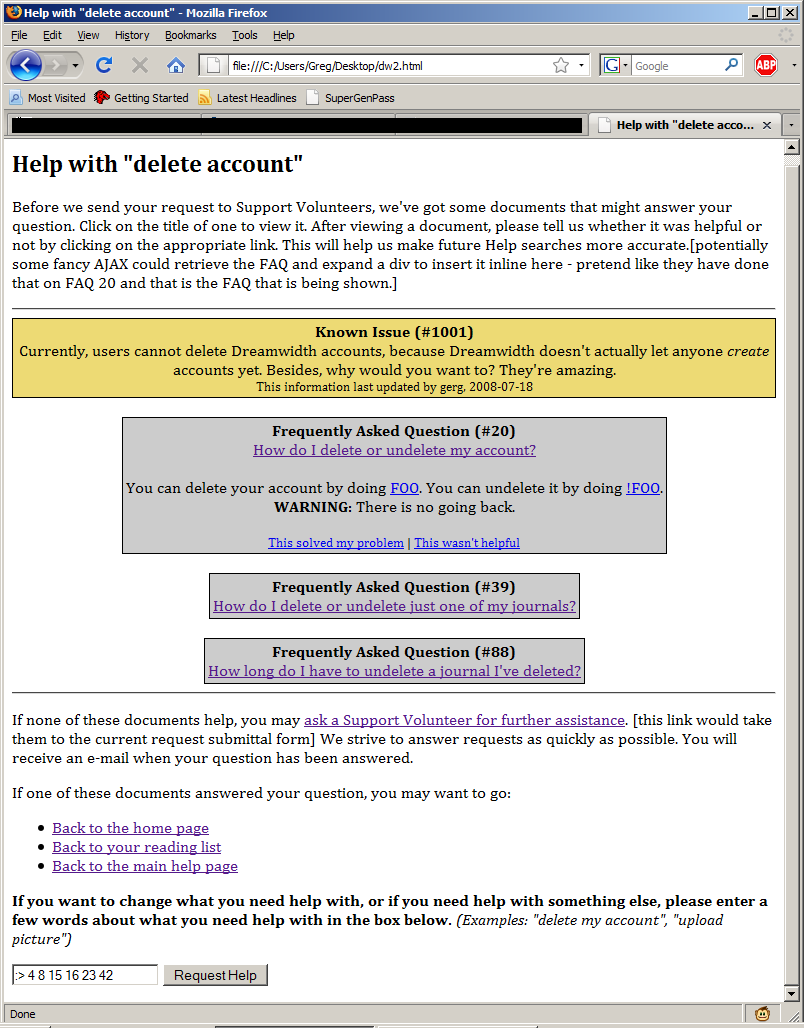
After the user enters what they need help with, they see a page like this:
The gold box appears if a known issue file is entered for that search term. KI files would be like FAQs, but in a separate database. Anyone with supporthelp priv would be able to create them, and they provide a way for small issues (like the RTE not working right in FF3, or the statistics not working for Russian users, etc.) to be able to be stopped from even filing requests, without polluting the box on the main page that will contain genuinely important things. Then, if the user doesn't think any of that is helpful, they can click the link to get to the request form anyway.
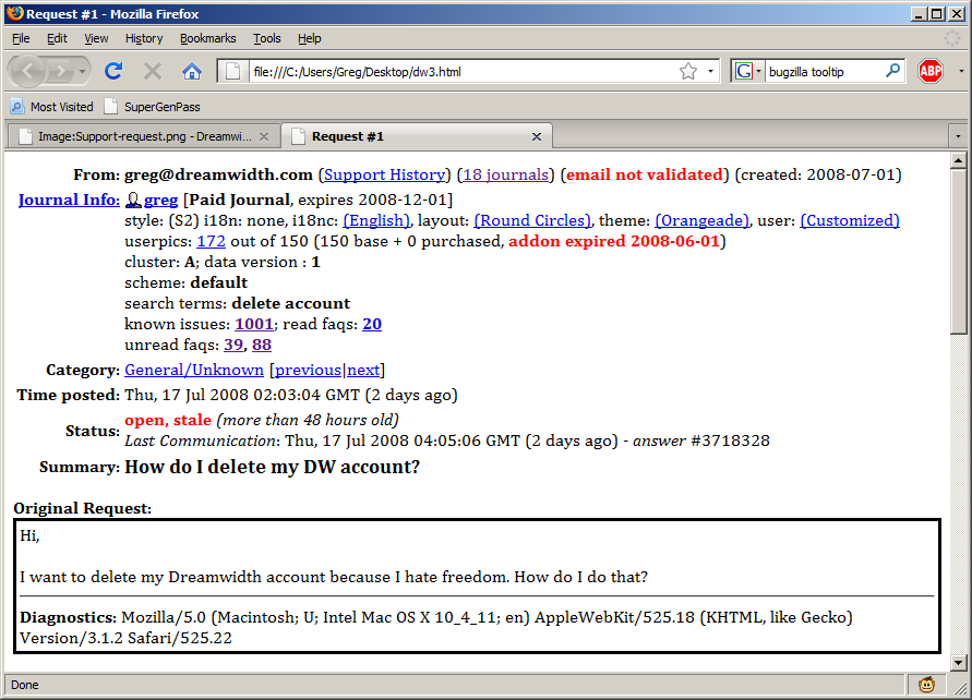
After that, the request is handled the same way. However, I am proposing a few changes to the see_request page as well. Here is my new version:
The changes are small but important. First, userpics are broken into base and purchased, so that UPI volunteers can see if the user currently has paid userpics. Mouseover text could be added with the expiration date of the add-on, if considered appropriate. I think DW's support architecture would lead to Support vols having more privs than they do on LJ (as in they will be able to see more.) The text on how many UPIs are used is also important so that people who have uploaded too many and have had some go inactive could be identified.
The next set contains the search terms the user used to get to the request form, the known issues files that were presented to them (if any), and the FAQs that were given to them. I envision that FAQs can be much shorter and much more direct answers to questions if this system is implemented. This way, volunteers know what has already been said to the user, so that there aren't "but I already tried that" fests. They also can say "as was shown when you opened this request, the system is down, yo." as appropriate.

